How does the convergence between humans and technology continue to evolve?
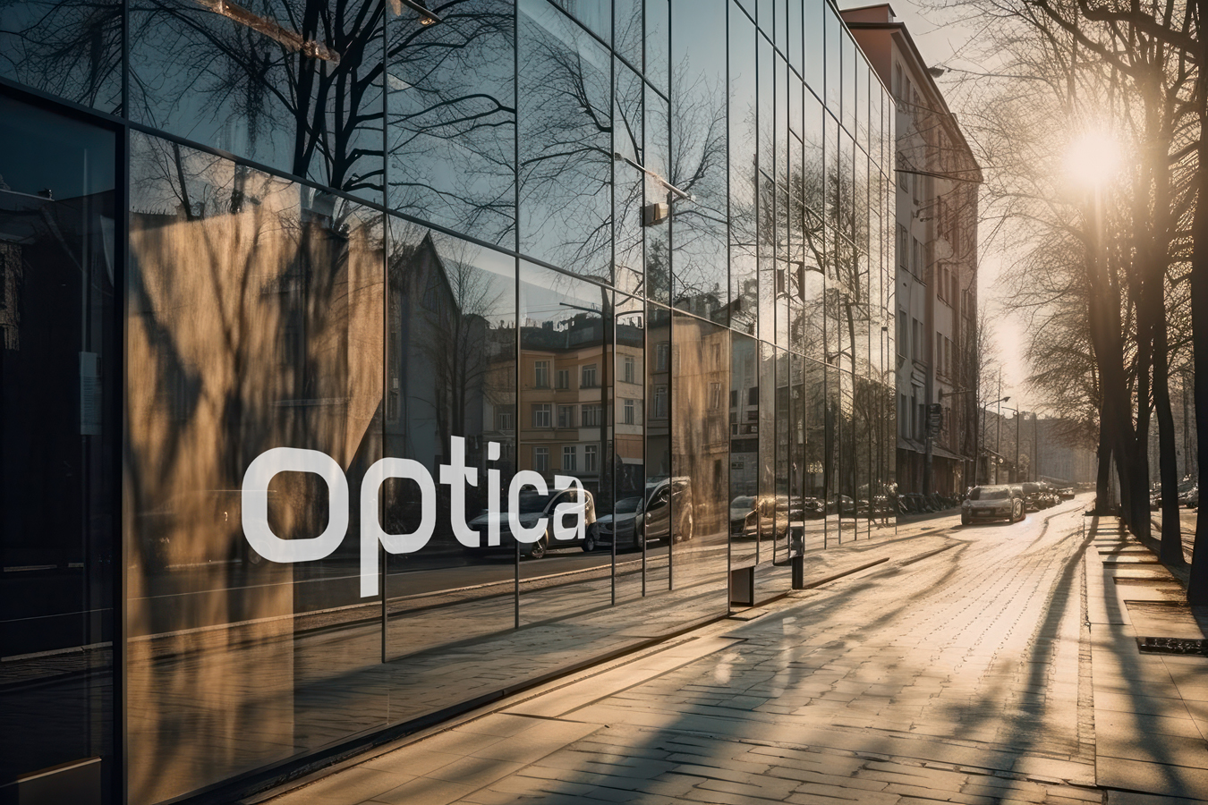
Fast forward to 2075, Optica emerges as a pioneer, revolutionizing the realms of healthcare, vision enhancement, and memory preservation with tech advancements in camera contact lens.
This fictional brand prototype encompasses the full process of branding a company from research and
development to designing a logo and strategizing their product line packaging and additional brand collateral.
01 The Company
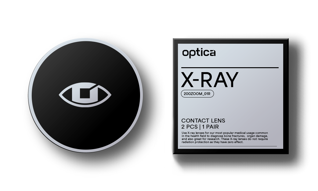
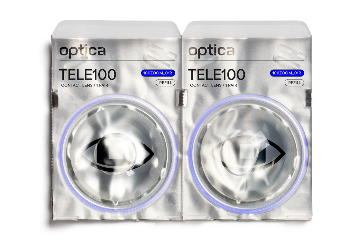
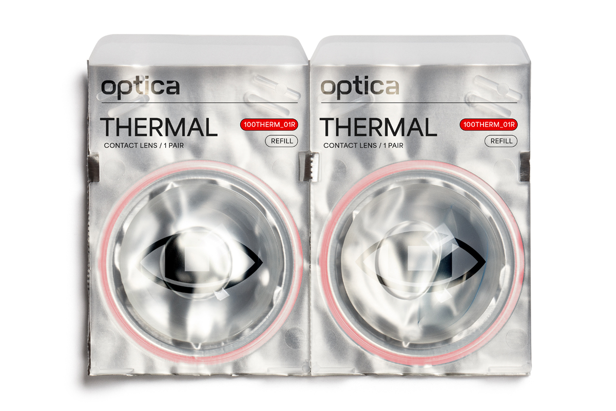
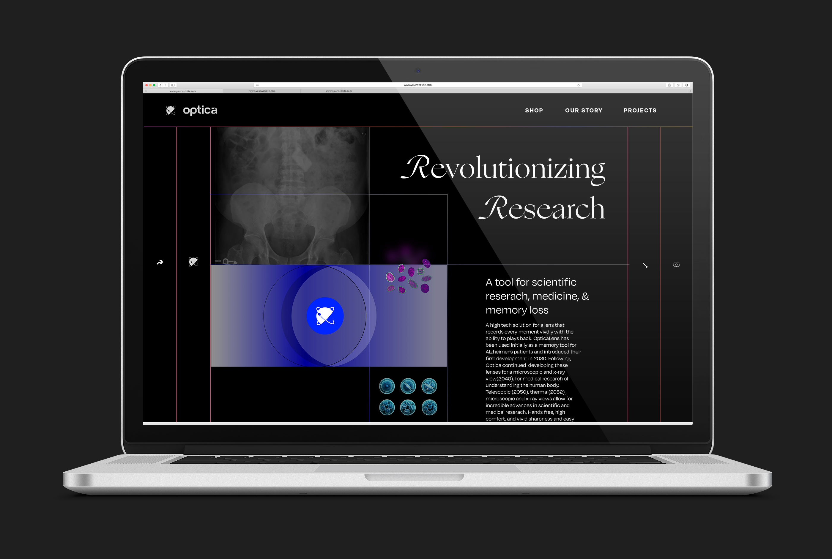
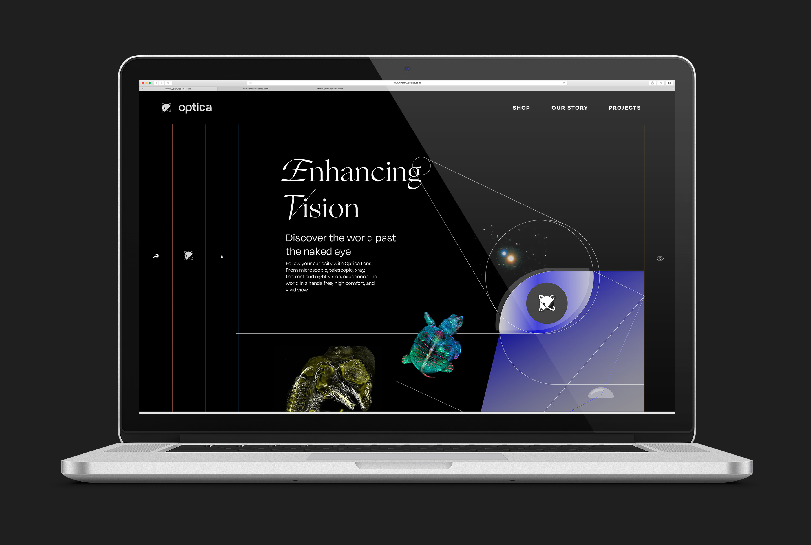
Optica develops camera contact lenses with unparalleled vision capabilities, from microscopic precision to telescopic magnification. These lenses not only enhance your sight but also seamlessly record everything into your memory database for easy access. Whether in real-time or revisiting memories, expect sharp, accurate, and vivid images.
Designed to transform your perception of the world, our lenses offer a range of options, including microscopic, telescopic, X-ray, thermal, and night vision. Perfect for exploration, research, medicine, security, and recreation, these lenses redefine how you experience life. Optica pursues the highest optics technology with softest comfortable contacts for a powerful way to see - live, experience and preserve life.


02 History
Founded in 2016 as the Vivue Reserach Laboratory, Optica was working on a new tech solution for a lens that would record and play back memory tool for Alzheimer’s patients and introduced their first development in 2030. Following, they continued developing these lenses for a microscopic and x-ray view (2040), for medical research of understanding the human body. As the company begun to expanded its range of views, these lenses began to to gain popularity. After launching their telescopic (2050), thermal (2052), night vision (2053). Many people around have adopted this new technology into their lives as a hands free way to document life and see differently.


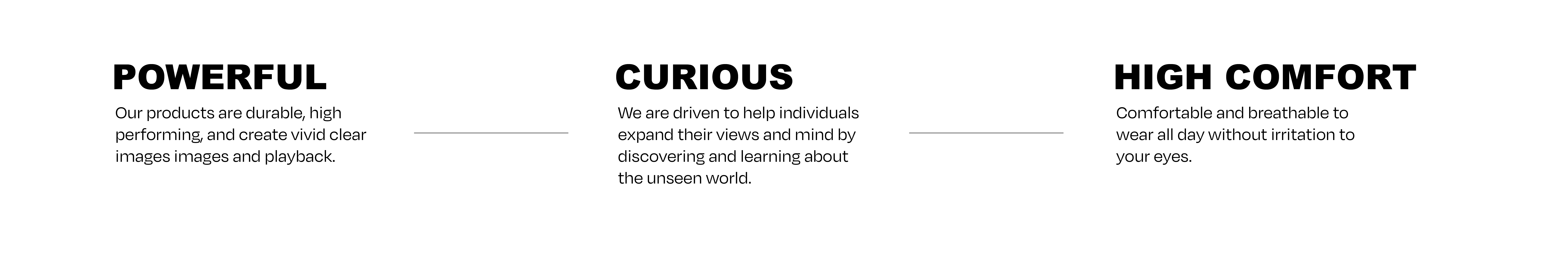
03 Values
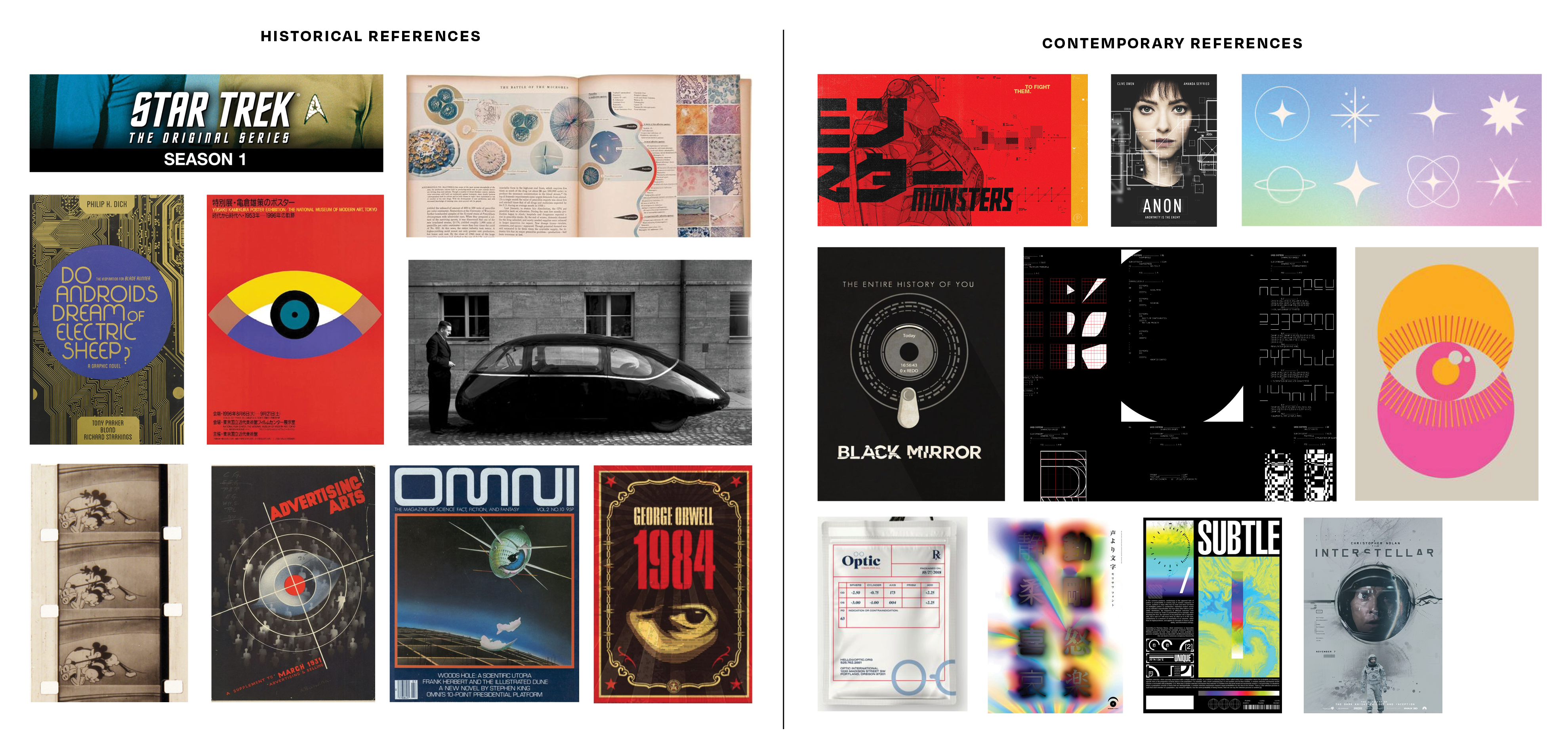
04 Moodboard
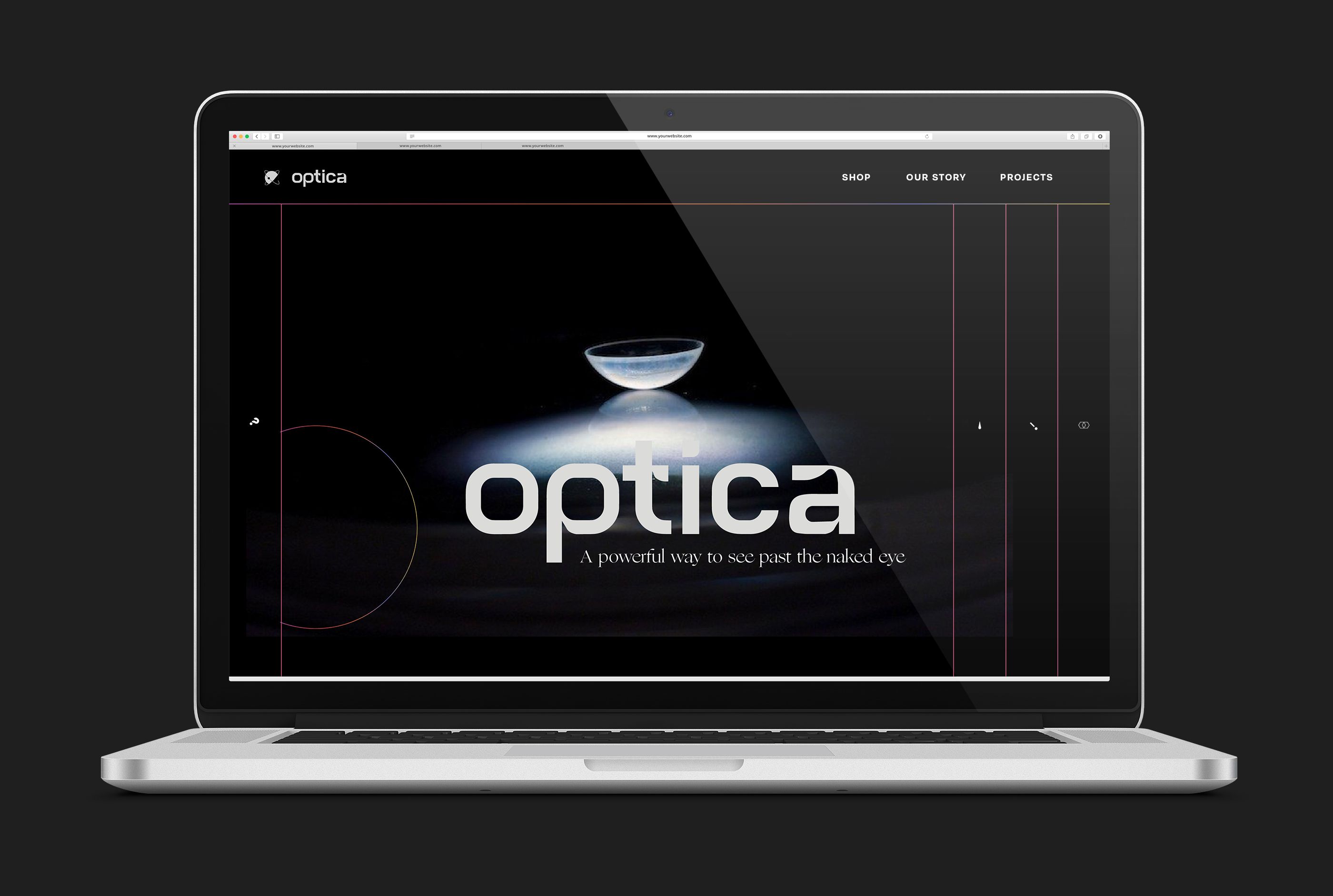
Branding and Design
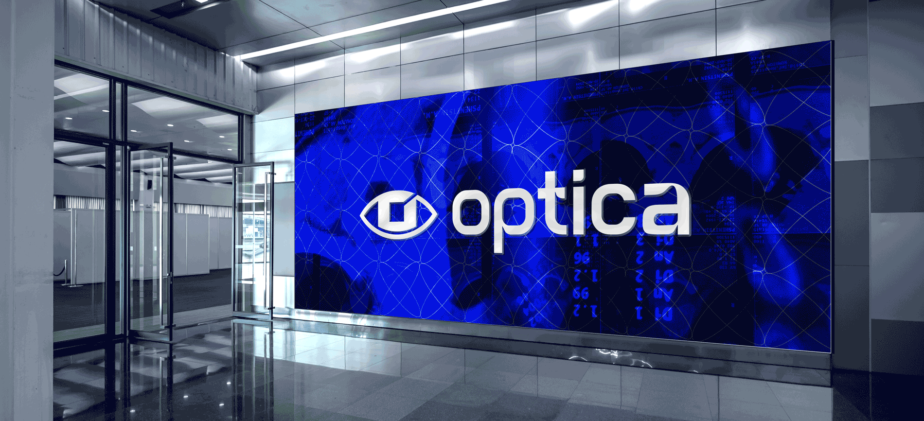
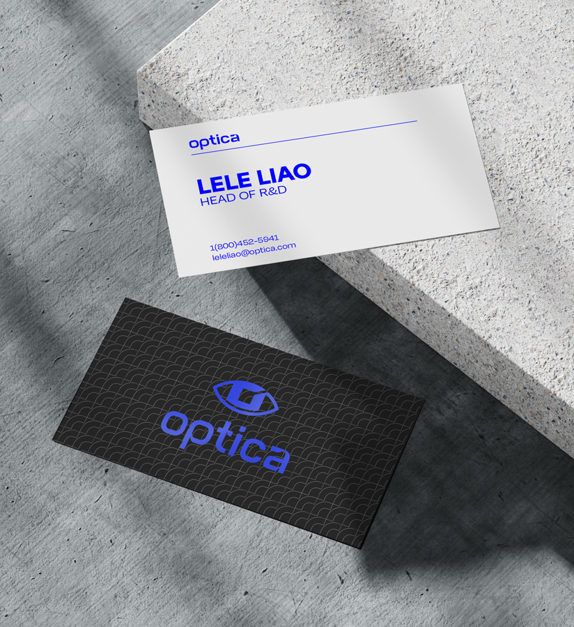
05 Logo Design
After a series of logomark form explorations, I returned to the shape of the eye which had the clearest communication that these products were for the eyes. We replayed the circular pupil form to a square, inspired by the pixels that make up photographs.
Initial Skeletons were explored for the Optica logotype. A range of san serifs were explored to give the brand a clean, modern, and sturdy and bold feel. A range of high contrast serifs were also explored since Optica products are both precise and powerful, as well as humanist which I tried to convey through high contrast serifs.
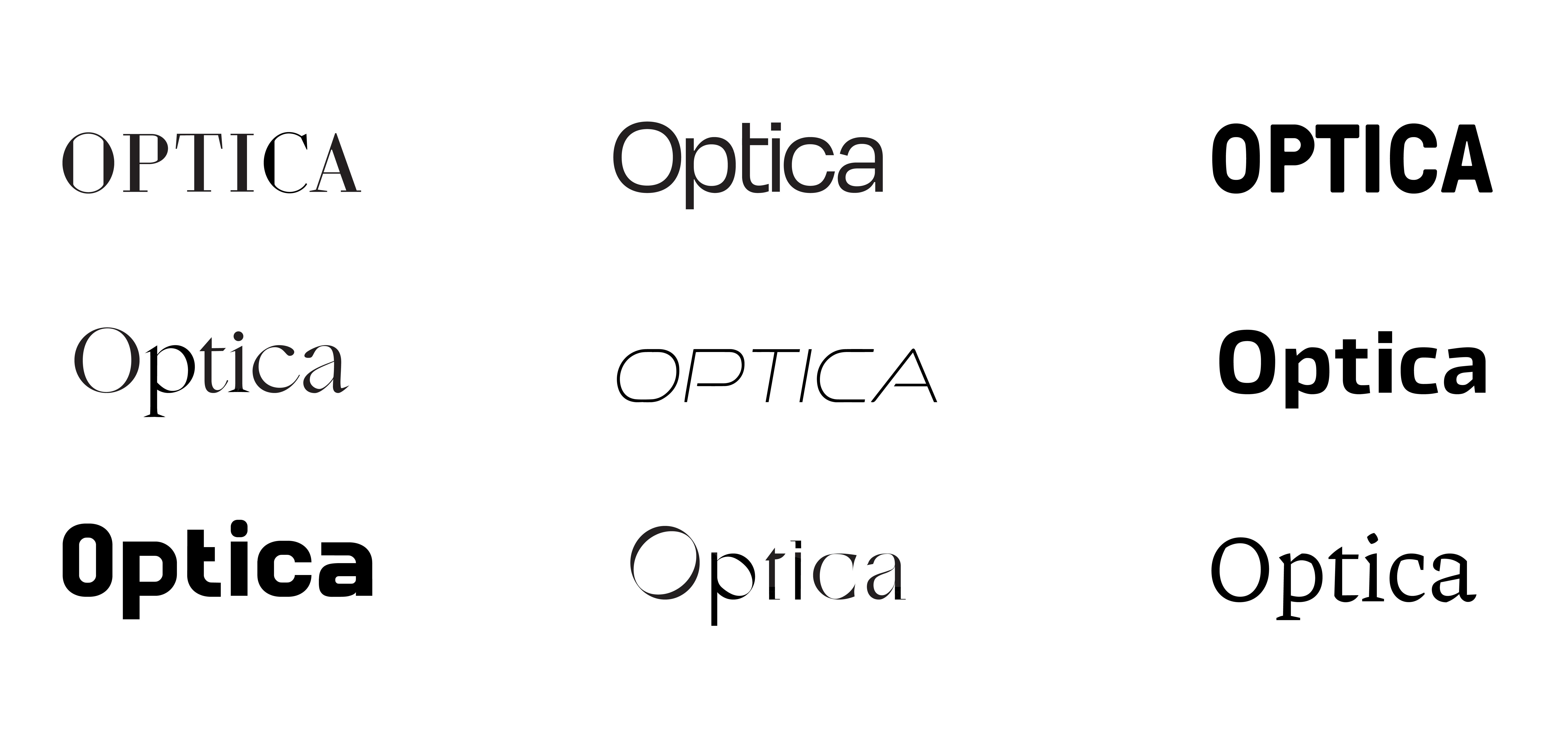
The bold sans serif conveys the power of this new technology, which is the primary attribute of the brand. Since these lenses connect us deeper to the human world, harsh corners were smoothed out and ink trap-like forms were incorporated. Final logotype and logo mockup.