
Label Series | Yerba Mate
2019
2019
Taking content from an original packaging, This is an exercise to control and create clear levels of hierarchy through type. Beginning with a strict modernist grid and only Helvetica 9pt, the steps progressed with adding more choices and vernacular from the packaging.
Tags
typography
print
2019
typography
2019
Process
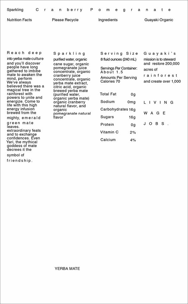
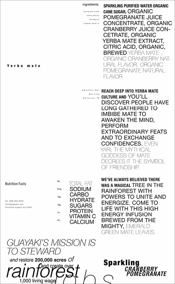
Round 1 | Using only 9pt Helvita with a modern grid, the challenge was to control and use only space to create contrast and heirarchy.


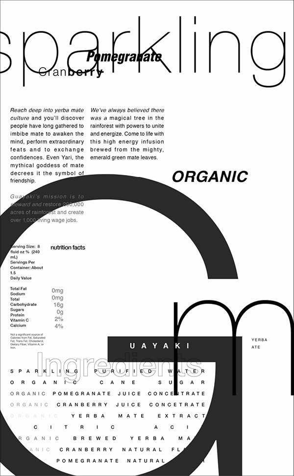
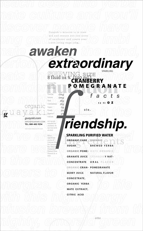
Round 2 | Using Helvetica in now any style (bold, italics, light, etc) and size, the variables of size and weight entered the picture.

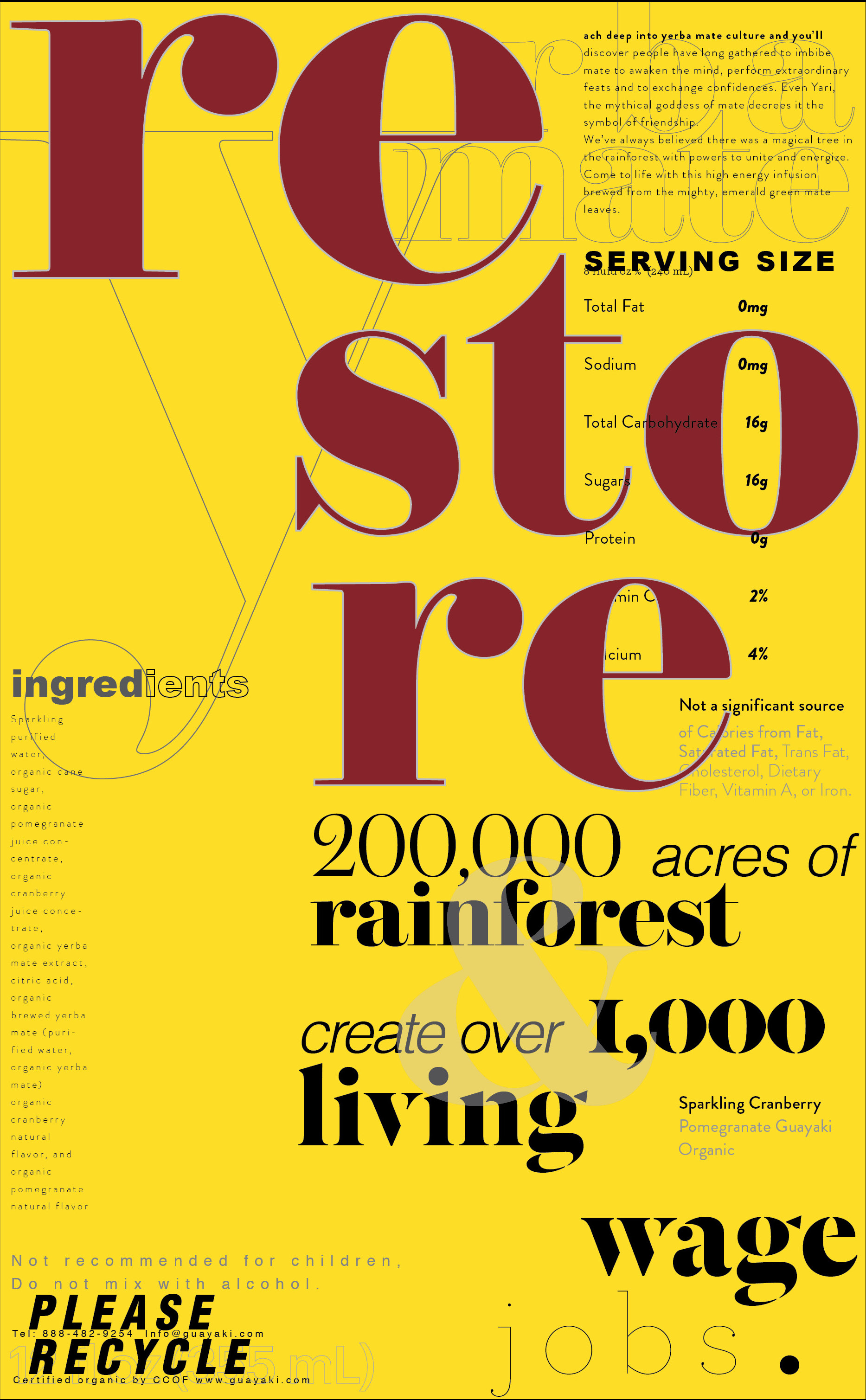
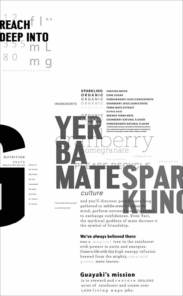
Round 3 - Any font was allowed, and now more options = more potential chaos. Here the challenge was to continue maintaining full control over all elements.

Final
Round 4 | Adding color and any vernacular from the original packaging, these are the two final designs.